A rangoli’s palette is judged by its relationships, not its inventory. The designs that stay in the memory are rarely the ones with the most colours; they are the ones where every colour appears exactly where it belongs — where contrast is deliberate, transitions are smooth, and the eye crosses the whole composition without once being confused. That result has a method behind it, and the method is the subject of this essay.
The wheel underneath
Two relationships from standard colour theory do most of the work. Complementary pairs — red with green, blue with orange, yellow with purple — sit opposite each other on the colour wheel and intensify each other on the ground: it is why marigold petals glow against a blue field and why green leaves make red blossoms look redder. Analogous families — yellow through orange into red, or blue through blue-green — sit beside each other and give the opposite gift: gentle transitions, natural unity, the calm sequences that floral work favours. The tradition arrived at both relationships by eye, through observation and repetition transmitted across generations, long before any wheel diagram named them.
The temperature of a design
Colours also carry apparent temperature, and temperature behaves spatially. Warm colours — red, orange, yellow — advance toward the viewer and energise; cool colours — blue, green, violet — recede and calm. A composition of only warm colour shouts; one of only cool colour sleeps. Practised work balances the two, and meters them with the neutrals: white for clarity, black for definition, earthen brown for grounding warmth that competes with nothing.
One palette, three jobs
Within any palette the working hierarchy is the one this chapter’s first essay introduced: a dominant colour to lead, supporting colours to carry, accents to punctuate. The hierarchy is what makes the palette legible — when every colour gets equal area and equal intensity, every colour competes and none wins. The accent rule surprises beginners most: a small patch of strong colour, placed well, carries further than a large field of the same colour placed carelessly.
The working method
The practice behind harmonious work is consistent enough to state as a sequence. See the design whole before refining any part — practitioners step back repeatedly, judging balance from the distance a viewer will use. Limit the palette — two- and three-colour designs succeed far more often than twenty-colour ones, and restraint is the cheapest improvement available. Set one focal point with converging means — the brightest colour, the strongest contrast, the finest detail, the central placement — and let repetition carry the eye outward from it: alternating colours around a border, recurring accents along the symmetry axes, rhythm rather than randomness. Where colours must meet softly, build gradients in patient tonal steps — the blends modern powders make possible reward care and punish haste. And keep open ground: unfilled space separates motifs, sharpens contrast, and gives the composition the rest that makes its density readable — the principle treated fully in The Empty Space.
What goes wrong
The failures are as consistent as the method. Too many colours with no hierarchy; too little contrast between neighbours, so forms blur; two focal points quarrelling over the viewer’s attention; colour spread unevenly, so one corner outweighs the rest; gradients that jump instead of stepping. The remedy in every case is the same habit — evaluate continuously while the work develops, and adjust before a small imbalance compounds into the finished design’s character.
One discipline, many traditions
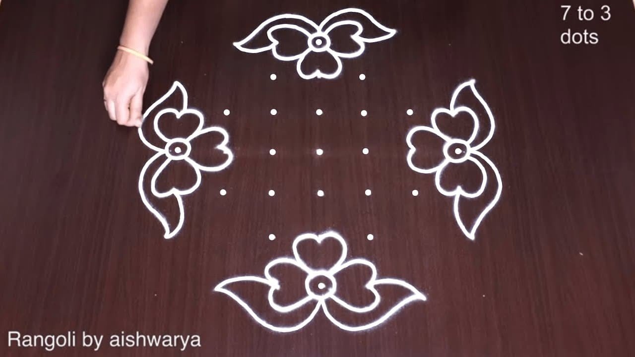
What makes these principles worth stating is that they hold across the tradition’s whole range. The daily kolam finds harmony in white alone, on line and spacing; mandana balances white forms against the warm earth ground it is drawn on; Kerala’s pookalam orchestrates the saturated abundance of flower petals; festival rangoli manages full polychrome. The materials and the palettes could hardly differ more, and the discipline underneath them — balance, proportion, hierarchy, rhythm, restraint — barely differs at all. Harmony is not a formula any of these styles owns; it is a practice they share.
References
- Vijaya Nagarajan, Feeding a Thousand Souls: Women, Ritual, and Ecology in India — An Exploration of the Kōlam, Oxford University Press, 2018.
- Marcia Ascher, Mathematics Elsewhere: An Exploration of Ideas Across Cultures, Princeton University Press, 2002.
Further Reading
- Kiwamu Yanagisawa & Shojiro Nagata, “Fundamental Study on Design System of Kolam Pattern”, Forma 22, 2007.
This entry publishes at Evidence Level E2: its claims rest on at least two independently verified sources.
Cite this entry: “Colour Harmony.” Rangoli Encyclopedia, Rangoli Designs, https://rangolidesigns.net/encyclopedia/colour-harmony/ — a permanent URL under the encyclopedia’s stable-identity policy. Entry last reviewed 2026-07-29.